
Balance & Beauty: How to Coordinate Shower Floor and Wall Tile By Chip Wade

Chip Wade is a designer, DIY expert, and Emmy-winning TV host known for bringing smart, stylish solutions to real-life renovation challenges. As the founder of Wade Works Creative and a longtime HGTV personality, Chip blends hands-on building experience with modern design sensibility, making him a go-to source for homeowners and pros alike. With a deep knowledge of materials like tile and stone, Chip shares practical, inspired ideas to help readers reimagine their spaces with confidence.
If you’re planning a bathroom renovation, chances are the shower is your main event…and for good reason. It’s one of the most used spaces in the whole house, and with the right combination of wall and floor tile, you can create a space that feels serene, stylish, and built to last. But choosing the perfect pairing can get overwhelming fast, especially with so many shapes, sizes, and finishes to choose from. After designing and building hundreds of bathrooms for TV shows, clients, and my own homes, I’ve learned exactly how to simplify the process and make smart tile choices that deliver both form and function.
Let’s break it down. Here’s how to coordinate shower wall and floor tile with confidence.
Contrast or Coordinate?
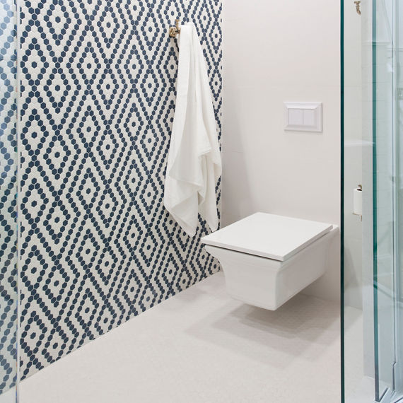
In the master shower at the lakeside log cabin, Misty Mill, a bold feature wall comes to life with a custom blend of Arctic White and Navy hexagon tile from the Keystones series. The nautical-inspired pattern adds energy to the space, while the soft white hexagon tile on the floor brings balance and serenity.
This shower at Misty Mill features a playful, custom mosaic tile that nods to the lakeside setting. The bold navy and white pattern is grounded by clean white floors and walls, creating a space that’s both fresh and refined.
Play with Scale (Yes, Size Matters)
Select Finishes with Function in Mind
Mix Shapes for Subtle Interest
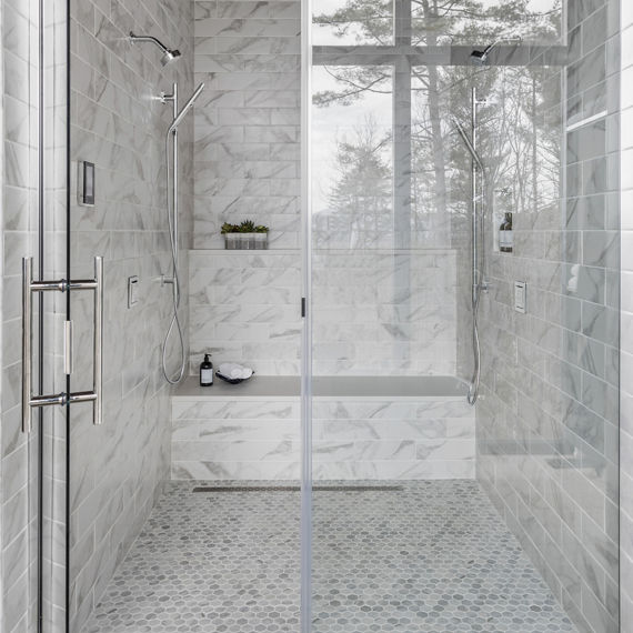
The primary shower at Pinhoti Peak features the Brilliant White Perpetuo series, with 4x12 rectangles on the walls and 1.5" hexagon tiles on the floor. Mixing shapes adds visual texture and designer polish without cluttering the clean aesthetic.
Don’t Forget the Grout Game
Grout color is like the frame on a painting; it can either make your tile pop or subtly blend it into the background. High-contrast grout (like black grout on white tile or white grout on black tile) emphasizes the shape and layout of the tile, giving the design more dimension and graphic impact. On the flip side, a tone-on-tone approach creates a more seamless, sleek look.
Make the Most of Your Niche
A shower niche is the perfect opportunity to layer in extra personality and play with contrast. Use the same tile as the floor for a cohesive look or introduce a completely different material that pops. It’s a small surface, but when done right, it can have a major visual impact.
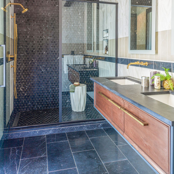
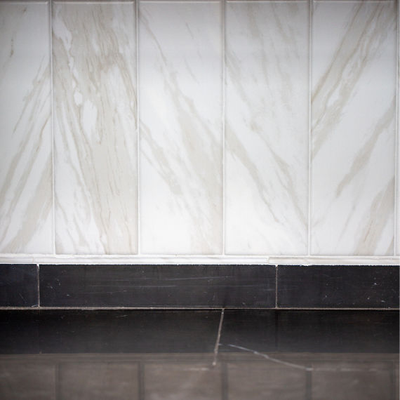
The ADU shower provides a great example of how contrast can elevate a design. The dark-shaded Nero Marquina tile anchors the shower floor, statement wall, and shower niche, creating bold drama against the surrounding subtle pattern of Timeless White and Elegant Beige wall tile. This combination of warm tones and rich accents adds balance and sophistication, keeping the space feeling modern while grounded and approachable.
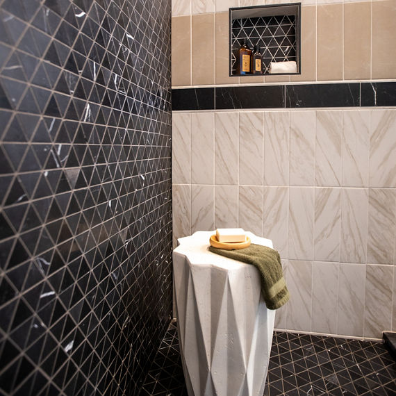
The niche in Pinhoti Peak’s ADU bathroom showcases Pietra Divina Nero Marquina tile, framed by vertically installed 4x12 Perpetuo tile in Timeless White and Elegant Beige for a striking, layered look.
Coordinating wall and floor tile doesn’t have to be complicated. With the right tools, expert help, and a little inspiration, it’s possible to create a space that not only looks stunning but also works hard for years to come. That’s what smart design is all about.