HOW TO CHOOSE CHECKERBOARD FLOOR TILE COLORS
The checkerboard floor tile pattern is as classic and elegant as it is eye-catching and versatile. Traditionally, the grid tends to be made up of black and white tiles, but depending on the style you're after, there are many other options. With some guidelines, you can choose a checkerboard look to suit your home and your style—whether you want a subtle or daring design. Here are some tips to help you get started.
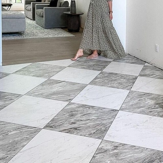
Diagonal Layout
Installing a checkerboard tile floor diagonally has a few benefits. For one, the arrowlike effect can make a room appear longer or wider than it is because the eye follows the points. For a larger space, the bigger the tiles, the more dramatic the effect; large, diagonal tiles act as pedestals and will highlight oversized or top-quality furniture. Laying tiles on a diagonal will also help downplay walls that aren't perfectly square, making this layout an ideal choice for older homes.
Neutral Tones
In a home that features some flair—whether it's mixed-metallic backsplashes, tongue-and-groove ceilings, or elaborate moldings—try opting for a checkerboard pattern that features a subtle white and tan tile or white and gray tile underfoot. The reserved colors won't compete with bold décor as assertively as a high-contrast color combination would. Furthermore, pairing white with neutral gray or tan is a safe choice—especially if you plan to sell your home in the future. Neutral checkerboard floor tile will also provide the perfect base if you decide to change the wall color, upholstery, or accent colors within your design.
Bright and Bold
High-contrast colors result in an edgy effect that screams ultramodern high-rise or condo lifestyle. Alternating white and red tiles, for example, can establish either an Asian appeal or a contemporary scheme. If you pair white tile with dark, bright, or aqua blue, you'll have the basis for a Southwestern or Mediterranean design. The simpler the décor, the better, so choose streamlined or minimalist pieces to go with a vibrant floor. When choosing the finishing touches, go with white, gray, or beige walls, pale granite countertops, and a white subway-tile backsplash in order to temper the bold flooring pattern.
SUBTLE PALE TONES
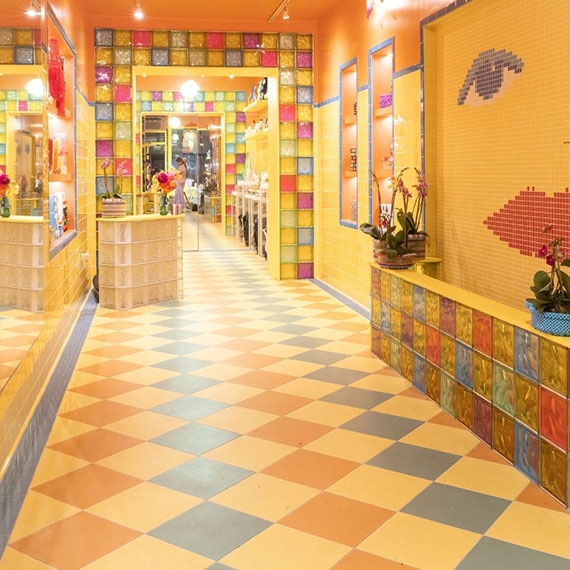
Pairing white tile with cream, pale blue, or light green tile in a checkerboard pattern provides the backdrop for a cottage or shabby-chic theme. You can even combine three or four subtle hues in order to form a patchwork effect that's similar to mixed-color carpet tiles. Finish off the space by decorating with pale décor in order to create a mellow, yet welcoming, vibe.
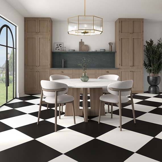
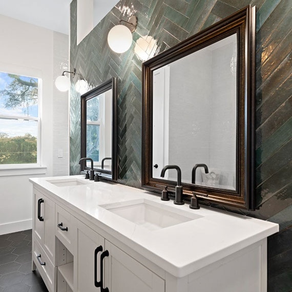
Classic Black & White
A traditional black-and-white tile floor provides optimal contrast, which can transform a space into one that commands attention. The pattern may originate from 1920s décor, but it provides an unexpected element when used within modern design, or an eclectic edge when used within a home that features mixed-period furniture and accessories. In a minimalist home, a black-and-white floor can act like a neutral stage for furniture and finishes.
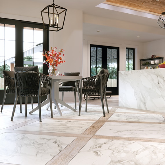
Mixed Media
Mixing tile media, such as marble, travertine, concrete-look, metallic, or dark slate tile with pale porcelain or ceramic tile, provides nearly limitless options that work for nearly any part of the home. This is a great way to add your own personality to your space. By mixing materials, you will also create textural depth and put a unique spin on your checkerboard floor tile.
There are a number of different checkerboard flooring patterns and color combinations. Use these suggestions to explore your options, and create a design that serves as the backdrop for your space. Whether it's bold, neutral, or complementary, a checkerboard floor is a special element that you and your guests will enjoy for many years.
DESIGNING WITH TILE

Fresh Off the Runway
Daltile designers consistently create the most on-trend, innovative tile in the country.