

When you think about tile design, you probably focus on the shape, size, or finish. But grout colors? That choice is just as important. The right grout color doesn’t just hold tile in place; it transforms the entire look of your space. Whether you want your tile to blend seamlessly or stand out with striking definition, grout color plays a starring role.
Matching Grout for a Seamless Look

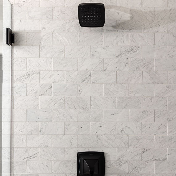
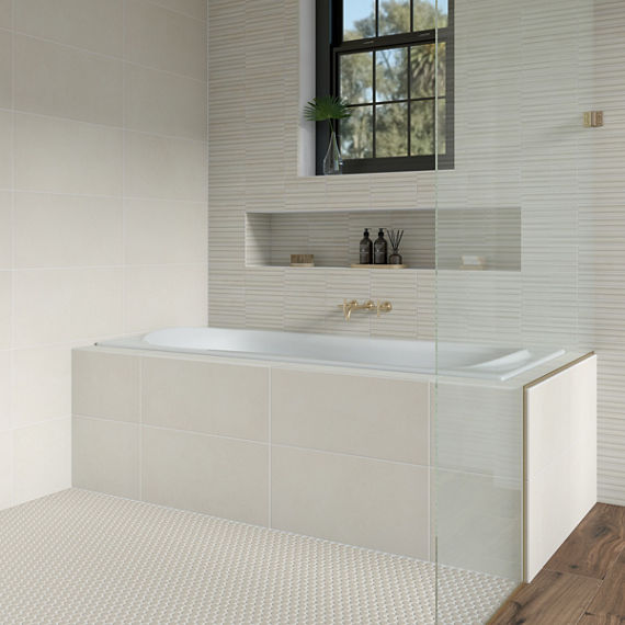
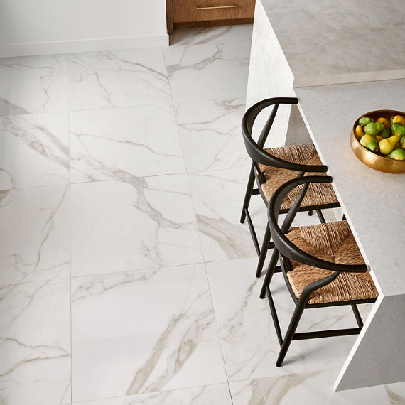
If you love a clean, modern feel, matching grout is the way to go. Choosing grout in the same shade as your tile creates one continuous surface, letting the beauty of the tile shine without interruption. This approach is especially effective in smaller rooms, where the seamless look helps expand the feel of the space. Matching grout also works beautifully with polished floor tile or textured wall tile where you want the design to remain subtle rather than pronounced.
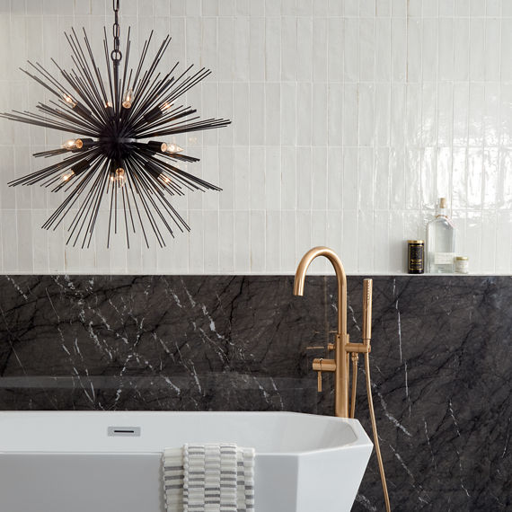
Contrasting Grout for Added Definition
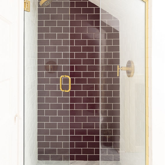
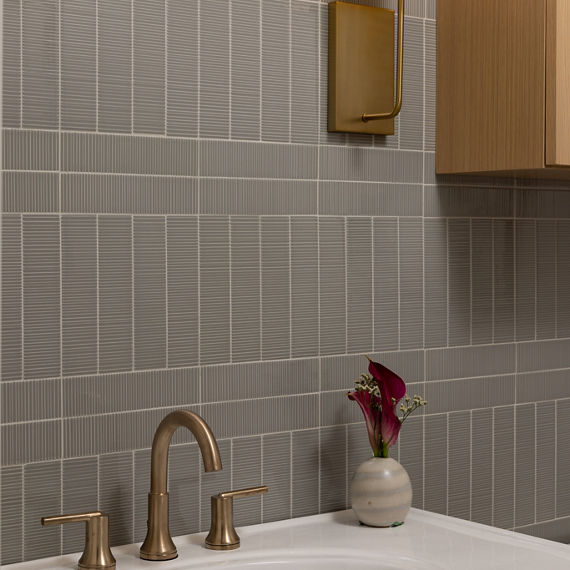
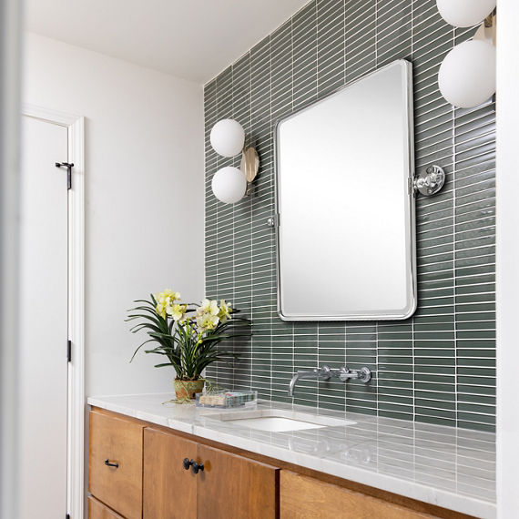
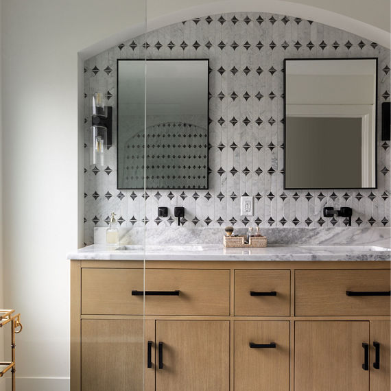
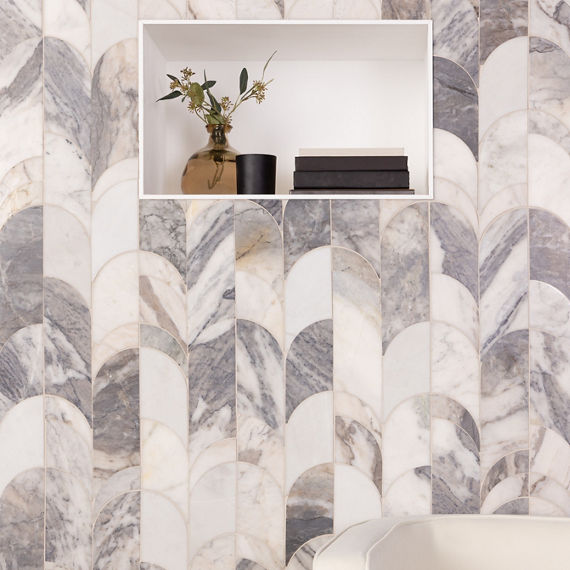
On the other end of the spectrum, contrasting grout lets you draw attention to the design. When the grout color is noticeably darker or lighter than the tile, it outlines every piece, emphasizing shape and layout. Think of subway tile backsplashes with dark grout that instantly highlight the classic pattern. Or mosaics where contrasting grout adds depth and character. This approach is perfect when you want your walls or floors to become a feature of the room.
Grout for Floor Tile vs Wall Tile
Not all grout decisions are equal, floors and walls come with their own considerations.
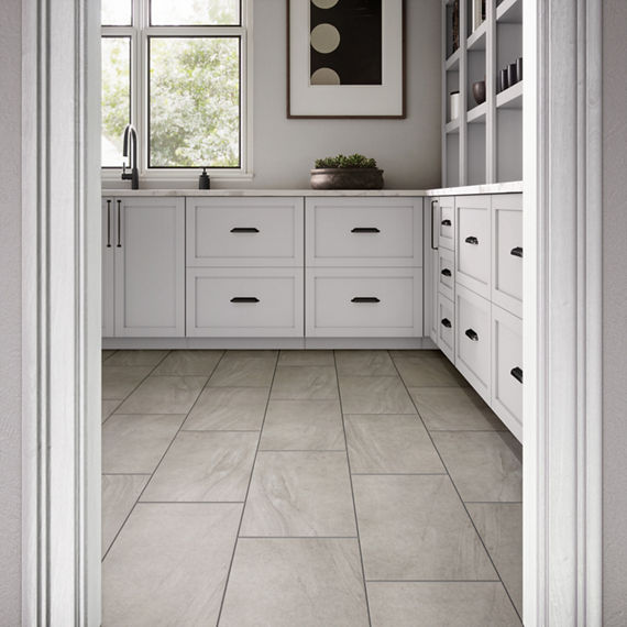
- Floor tile: Durability is key. Medium to darker grout colors often make the most sense here since they do a better job of concealing dirt and wear.
- Wall tile: Here’s where you can play more freely. Light grout can keep things airy, while a darker tone emphasizes patterns like herringbone or hexagon. Because walls don’t endure foot traffic, your grout color can be chosen almost entirely for style.

Other Considerations for Grout Color


Grout width matters. Thin grout lines create a more refined, subtle look, while wider lines highlight the grid and make the pattern more noticeable. Tile finish also plays a role, glossy surfaces might make grout appear darker, while matte surfaces soften the effect. And don’t forget about lighting. Natural light versus artificial light can shift how grout colors appear in your space, so always test samples before making your final decision.
Visualize Your Options Before You Decide

It’s not always easy to picture how grout colors will look once installed, which is why visualization is so important. Imagine both seamless and high-contrast options to see what fits your design vision best. And if you’re still not sure, our expert designers are here to help.
The bottom line? Grout color isn’t just practical; it’s a design choice that can completely change the look of your tile installation. Whether you prefer seamless or defined, the right grout color elevates your space.
Schedule a free design consultation today and get personalized guidance to bring your vision to life.