Beyond Beige: How to Add Color to a Neutral Space
There was a time when every room was a shade of gray, beige, or greige. It was a safe, uniform palette that promised longevity, but as design evolves, so does the desire for more personal expression. Today’s interiors embrace individuality, using color not as an accent but as an extension of personality.
Adding color doesn’t mean abandoning the timeless calm of neutrals. Instead, it’s about layering warmth, depth, and emotion through thoughtful choices that feel intentional rather than overwhelming. Here’s how to bring color into your home with confidence.
Start with a Neutral Foundation

If you’re updating flooring or a feature wall, opt for natural textures that ground your palette, like subtle veining, matte finishes, or soft movement that adds visual interest without visual noise.
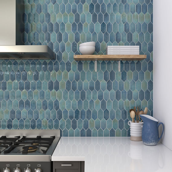
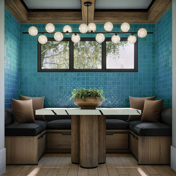
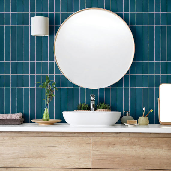
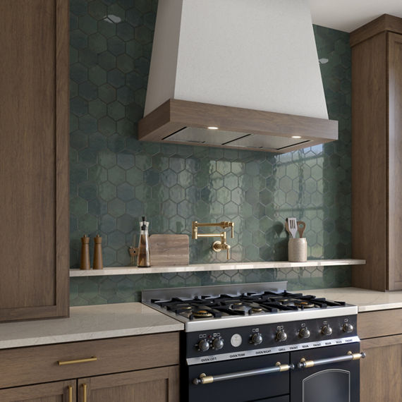
Choose Colors That Feel Like Neutrals
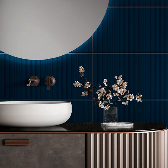
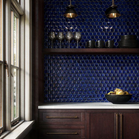
- Navy conveys confidence and pairs effortlessly with white, beige, and wood tones. Try a navy backsplash or tiled shower niche for a refined statement.
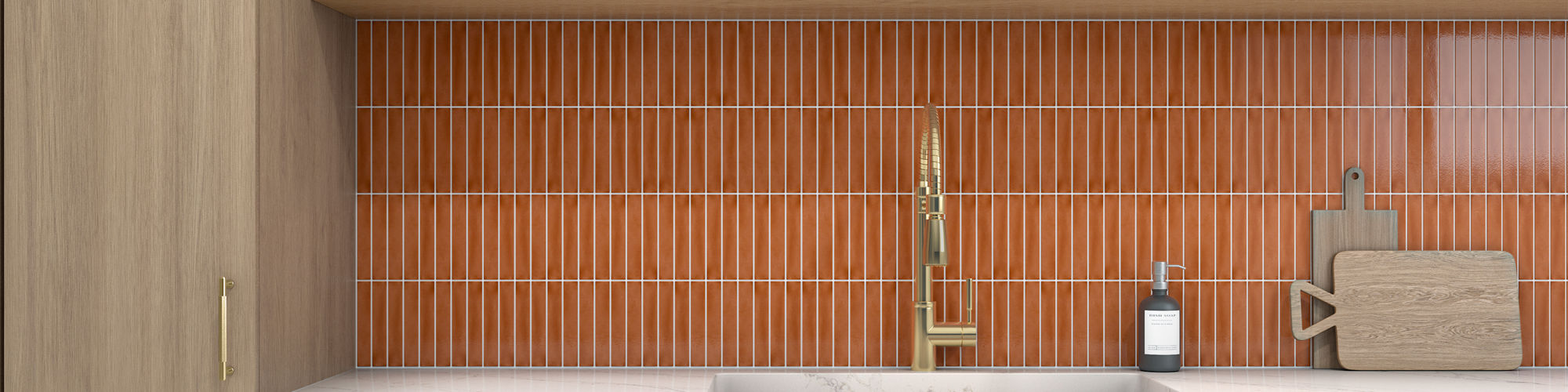
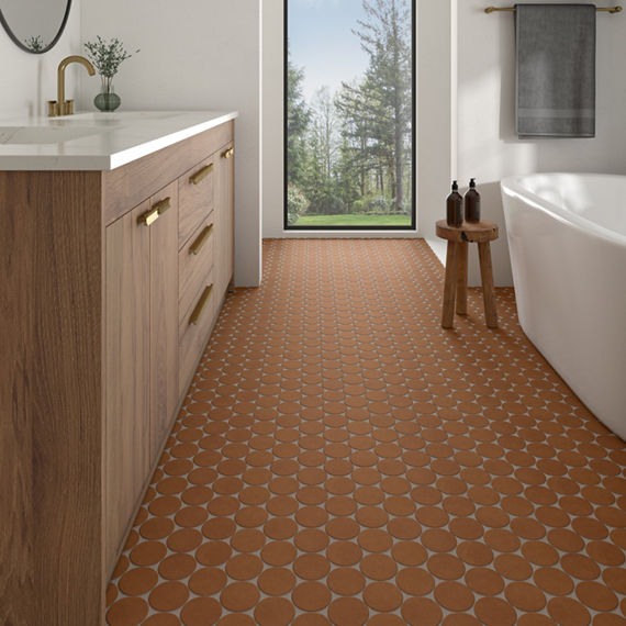
- Terracotta brings warmth and character to minimal spaces. Use it in hexagon or herringbone tiles to create dimension that feels natural and lived in.
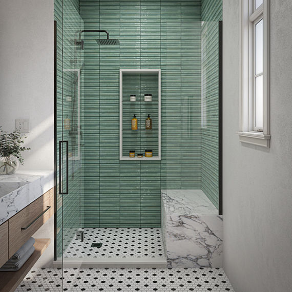
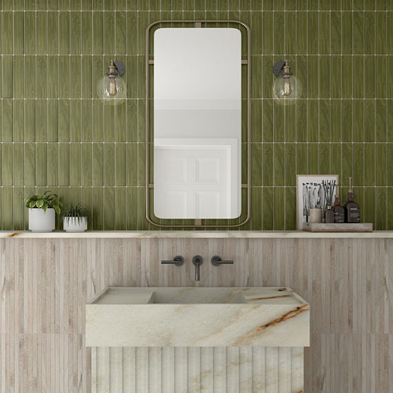
- Olive green is the new neutral for organic interiors. Whether on a kitchen backsplash or bathroom wall, it connects indoor spaces to nature in a subtle, grounding way.
These tones give depth and richness without overpowering the calm of your space.
Add Pops with Purpose
Express Your Personality Through Detail