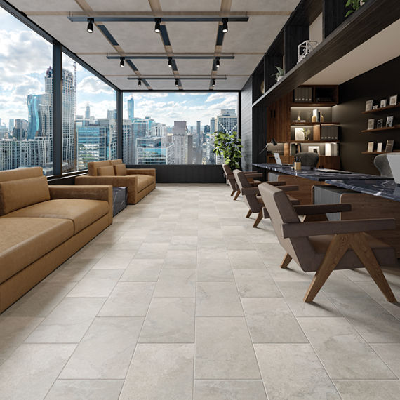
Color has the power to transform a space, not just aesthetically but emotionally. In commercial interiors, color choices can influence productivity, perception, and overall well-being. Applying color theory is more than an art; it is a science that informs every design decision. Because tile is a permanent finish, understanding how hue, shade, tone, and intensity work together ensures spaces remain timeless, purposeful, and aligned with project goals.
Understanding the Basics of Color Theory
The Color Wheel as Your Guide
Color theory begins with the color wheel, a visual map that helps designers understand how colors relate and interact. The wheel is divided into primary colors (red, blue, yellow), which combine to form secondary colors (orange, green, violet), and tertiary colors, created by mixing a primary with a neighboring secondary color.
Designers use the color wheel to visualize balance, contrast, and flow within a palette. Each type of color relationship offers a different effect:
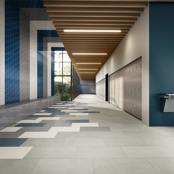
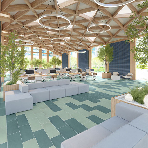
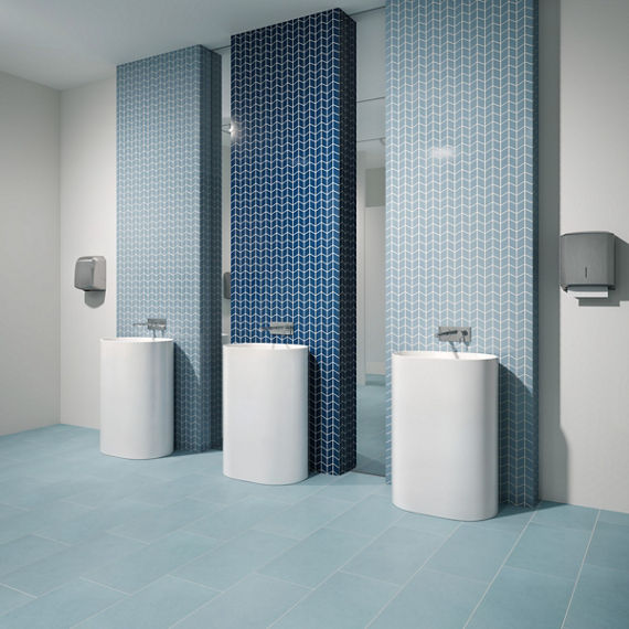
Analogous palettes feature colors next to one another on the wheel, such as blue, blue-green, and green. These create subtle harmony and a sense of continuity, making them ideal for environments where calm and cohesion are key, such as corporate offices or healthcare settings.
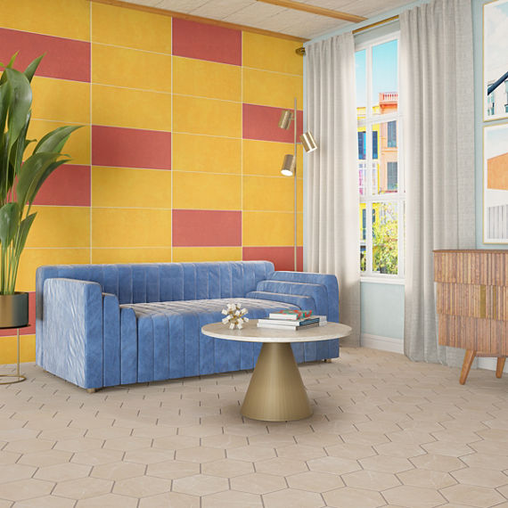
Complementary palettes pair colors directly opposite each other on the wheel, like blue and orange. This combination delivers bold contrast and high visual energy, often used in hospitality, retail, or entertainment environments that benefit from dynamic design.
Triadic palettes use three colors evenly spaced around the wheel, such as red, yellow, and blue. These palettes bring vibrancy and balance when applied thoughtfully, perfect for education or creative workspaces.
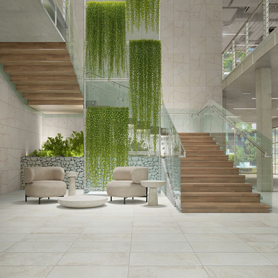
Monochromatic palettes explore one color family in varying shades and tones, creating sophistication through depth rather than contrast. These are often used in luxury or minimalist commercial interiors.
Our
Colorology program brings these principles to life by organizing colors into curated families that make it easier to build harmonious palettes across tile collections.
Going Beyond Hue: Shade, Tone, and Intensity
Shade: Deepening Color for Drama
When black is added to a hue, it creates a shade that adds richness and depth. In hospitality lounges or luxury retail environments, deeper shades can establish mood, enhance drama, and deliver a sense of sophistication without overwhelming the space.
Tone: Creating Sophistication with Muted Color
Tones are created by adding gray to a hue, softening saturation and creating versatility. Muted tones help balance bold color and are especially effective in environments that require focus and calm, such as healthcare or corporate settings.
Intensity: Using Brightness Strategically
Intensity determines how vivid or subdued a color appears. High-intensity hues energize and attract attention, while low-intensity hues ground a space and create tranquility. By adjusting intensity, designers can influence mood, energy, and visual comfort in every environment.
Easy Wins for Commercial Tile Design
Some color strategies consistently achieve balance and longevity:
- Neutral bases with vibrant accents for timeless appeal
- Earth-inspired palettes that support wellness-driven design
- Complementary pairs in softened tones for sophisticated contrast
With the Colorology program, it is simple to explore coordinating and complementary palettes efficiently while maintaining creative control.
Bringing Color Theory to Life with Tile
Tile offers permanence and versatility, making it the ideal medium for applying color theory. Whether layering subtle analogous hues or introducing bold complementary contrasts, color in tile has the power to define how a space feels and functions.
Through the Colorology program and an extensive range of color families, designers can explore the full spectrum of color confidently, creating interiors that inspire connection and stand the test of time.
Color theory bridges the gap between beauty and function. When applied to tile design, it becomes the foundation for enduring, inspired spaces that perform as beautifully as they look.
Explore the
Colorology program to discover color families designed to simplify your palette selection and bring science, style, and confidence to every project.